
Johns Hopkins Medicine researchers develop an image-based computer model of tumor behavior that captures more of the complexity of cancer growth
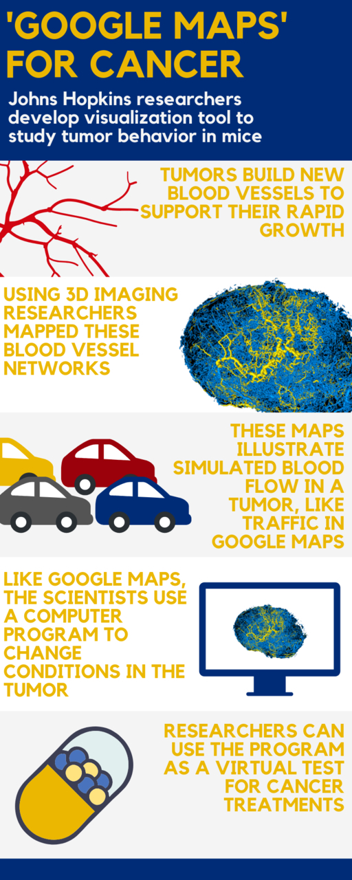
Johns Hopkins Medicine researchers say they have developed something akin to a “Google Maps” approach for more accurately computing and visualizing the structural and functional blood vessel changes needed for tumor growth. By pairing high-quality 3D imaging data of tumor specimens from animal models with sophisticated mathematical formulas, the researchers say they now have a model that accurately represents blood traffic inside tumors, including the complex blood flow, oxygenation and structural changes that occur.
This work was published March 27 in Nature Scientific Reports.
Arvind Pathak, Ph.D., the study’s leader, says the project was developed out of the need to address the complexities of cancer biology in growing and developing tumors. He saw the need for better predictive models, as many existing models employed rudimentary approximations of the complex geometry of a tumor’s blood vessels.
“Poor representations of the tumor ‘microenvironment’ make models and the research based on them less accurate. So I thought, how I can use my imaging expertise to improve the information available to modelers?” says Pathak, associate professor of radiology and biomedical engineering at the Johns Hopkins University School of Medicine and a member of the Johns Hopkins Kimmel Cancer Center.
To create a model that more precisely reflected the structure and behavior of tumors, his research team implanted mice with human breast tumor cells and imaged the resulting tumors using 3D magnetic resonance microscopy and micro-CT imaging. These high-resolution 3D images provided detailed information about a tumor’s volume and the structure of its blood vessel networks.
With the underlying blood vessel structure mapped, Pathak and his research team scoured the scientific literature to find information on how these structures would likely behave in a living system. Specifically, they searched for studies that included measurements of blood pressure, blood flow and volume in vessels similar to those seen in their tumors.
Using this information, the group collaborated with Aleksander Popel’s Systems Biology Laboratory in the Department of Biomedical Engineering at the Johns Hopkins University School of Medicine to develop a set of mathematical formulas designed to represent these aspects of tumors. They did this by combining data from previously published studies with the information they collected.
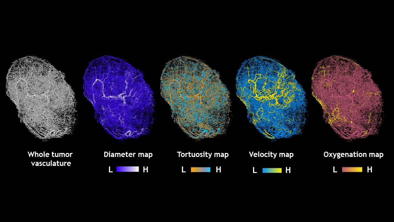
“The image-based model comprises thousands of data points about the predicted blood flow and intravascular oxygenation throughout tumors,” Pathak says.
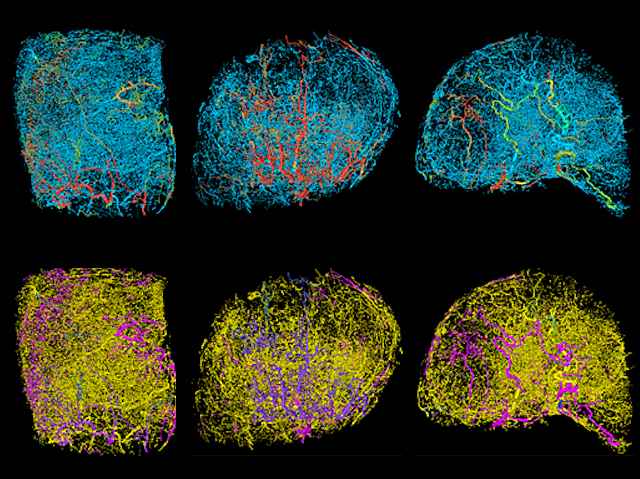
Mapping vessel growth in whole tumors reveals differences that could be exploited therapeutically. This image was featured on Biomedical Picture of the Day.
The next challenge for the group was to make the information they collected easy to see and understand, in much the way that web-based geographical maps can be easily seen and overlaid with different kinds of useful information such as travel time, traffic activity, detours and average speed.
“We had to create a completely new way to represent the information we had generated so that it is meaningful and not overwhelming to those who need to understand and use it,” says Pathak.
To do that, Pathak recruited Akanksha Bhargava, Ph.D., a mechanical engineer and postdoctoral fellow in the Systems Biology Laboratory, to build on the mathematical models established by Spyros Stamatelos, Ph.D. “We brainstormed about different ways to superimpose the modeling results onto the underlying blood vessel geometry without compromising the complexity and richness of the data,” says Bhargava.
The result, he says, was a 3D representation of the blood vessel network of each tumor with a color-coded map of the traffic-like movements of blood through the vessels that feed it. “It looked an awful lot like Google Maps,” says Pathak, “The blood vessel segments are the streets and the blood flow in each segment is analogous to the traffic along each street.” And like mapping apps, he says, the model gives researchers a more accurate depiction of what is happening within a tumor at any given time, adds Pathak. These compelling visualizations have already garnered the attention of the scientific community and were featured as the “biomedical picture of the day” by the MRC London Institute of Medical Sciences.
Maps of tumors grown in mice
Credit: Arvind Pathak, Ph.D.
Pathak says the team plans to make these images freely available to the scientific community for research purposes. The model can be made interactive, so that users can alter parameters such as the width of blood vessels to observe the effect on blood flow and the delivery of drugs or other treatments on the tumor.
The investigators caution that the approach is not directly applicable to human tumors yet. But, says Pathak, “As our ability to obtain high-resolution images in the clinic improves, we hope that this tool can be adapted to provide a noninvasive way to predict the behavior of an individual patient’s cancer and customize their therapy.”
At present, the model should be useful for bioengineers and cancer biologists to more easily study aspects of tumor biology “in silico,” as well as conduct tests for potential therapies.
Other researchers involved in this study include Eugene Kim of the Johns Hopkins University School of Medicine.
This work was supported by the National Cancer Institute (1R01CA196701, 1R21CA175784, 5R01CA138264).
The authors declare no competing interests.
This story was featured on Johns Hopkins Medicine Newsroom.